
Colors Are Your Friends or…Let’s talk a bit about my color theory is a series of blog posts dedicated to the topic on colors, how I use them and how I treat them. As this seemed to be liked by a lot of my readers- I gathered all blogposts here again so you can always come back and look at it as a reference.
Colors Are Your Friends or let’s talk a bit of “my” Color Theory I
22TuesdayMay 2012
What I hear most often about my work…and sometimes I am not sure if it is meant as a compliment- hahahaha- is that my color combinations strike as unusual. Sometimes I get asked how I thought of putting those colors together. Truth is…I do not think that much about it anymore…but …I came a long way experimenting and trying things ![]() So I thought I would share with you my philosophy of colors in a couple blog posts and also refresh some color theory stuff.
So I thought I would share with you my philosophy of colors in a couple blog posts and also refresh some color theory stuff.
My philosophy which I often share in my classes is:

If you want to work with paint media- wether it be acrylic paints or others – you have to treat colors as if they are your friends. They have different personalities and there is a different time and a different place where you want to spent time with a certain friend. I could also say – Colors are LIKE my friends, but hey…I don’t want to start explaining which friend of mine reminds me of which color- LOL. I wanna keep my friends ![]()
So before I go into the whole lot of color theory, color wheel and mixing …let’s look at those colors lightly first…let me introduce my friends to you, meaning the colors that I tend to meet often.

Yellow is a pretty new friend of mine, I am still a bit cautious with Yellow…I am never sure where yellow is heading to with my other friends. Yellow is light and a very positive friend. Yellow is kind of extrovert…boy…yellow is really really loud sometimes. Yellow is always intruding but mostly in a happy way. Yellow is my outspoken friend. My friend yellow can be pretty negative too though…sometimes jalous and sometimes a coward.
Here are some samples where I used yellow prominently:


As you can see I use yellow to make statements a lot.

Blue is an old friend of mine. Blue is a bit passive, calming and refreshing. What I like about Blue is, that Blue is open to everything. I like that I can bring blue in with most of my other friends and that Blue is never really overpowering. Blue makes me also sad sometimes…but Blue is a good sport…


Ah Blue….

Red is a handful! Red is so passionate and polarizing. Pretty much a drama queen when with others, sometimes also aggressive. Red is always overpowering, always wants to be in the foreground. Can’t be quiet…can’t be in the background too much. But Red is warm and it is so much fun to be around Red…it is sometimes the life of a party ![]()


My first round of friends – more of my close friends will come tomorrow.
What are your favorite colors that you tend to use the most often?
————————————————————————————
Colors Are Your Friends or let’s talk a bit of “my” Color Theory II

If you missed the first part of this series – you might want to check out this post first, so you know what me crazy girl is talking about ![]()
So I introduced you to my friends Yellow, Blue and Red…let’s see who else is there.

My buddy Orange is pretty social and communicative. Most of my friends like Orange. Orange also makes other friends stand out, Orange pushes them, but in a good way. Orange is warm and fun.


Next up is

Green is actually one of my very best and oldest friends. It is variable and contradictory at times. Green likes to blend in with my other friends, which makes it very easy to get along with green. Green doesn’t like conflicts and it is a good mentor to ease things. Green stabilizes. It is my most constant partner ![]()


Now next

I know, I know…some evil tongues say Black is not a friend aka color. Pah…that is bullying! Black is an awesome friend. It is all friends! Black is serious, and sometimes a bit humorless, but Black can be such a great supporter if you do not take Black to serious. Black also has this amazing ability to make other friends shine. Black in doses is awesome….but if you are around Black too much it might make you depressive so you have to pick your time with Black wisely ![]()


Well…now that I introduced you to my friends- I will be talking about mixing and matching in the next “Colors are Your Friends” Post. Hope you enjoyed the first two parts ![]()
Now…is there a color I didn’t introduce that you think has a certain personality?
————————————————————————————
Colors Are Your Friends or let’s talk a bit of “my” Color Theory III
29TuesdayMay 2012
Now we have talked about our friends in the last two parts…they are quite a handful, aren’t they? I also got introduced to your friends…Loved what I was reading:
Sue Clarke: Purple…so royal and yet playful!…
Dottie: Loved your posts on color! Made me think that black and white are sort of like the adults. All the other color children are running around on the canvas displaying all their glory and exuberence in their own personality and style, The adults come in to offer a little containment and accent…
Caroline: you could do white, even if it is a bit the same as black some people say it’s not a color. But there are a lot of other voices that are saying that white is the color that means pure, hope, innocence, clean, …Then there is pink that is totally “think pink” Red the color off passion and warmth…
So now that we have thought a bit about their personality we might wanna study our friends a bit more. Kind of like the CSI of colors ![]()
Remember the Color Wheel?

Good old color wheel – that is how I started years ago exploring colors. I made one for you…actually the plan was that you could download it…but you know…smarty-pants forgot that her scanner is not THAT big – so the color wheel is bigger than the size of my scanner…and …oh well…
BUT- you can definitely make your own …*snigger* or you just google color wheel if you are lazy and you will find thousands and can just download one of them.
So let’s start with some basics here and we talk about pigment colors…because color theory is so much more complicated (just open your printer and look which colors are in there to be mixed- different world!)…we keep it easy, ok? – for most of you it is a refresher I’m pretty sure- but it is never bad to get some refreshing, right?
Primary Colors:

Your friends Red, Blue and Yellow carry the last name Primary. Those guys cannot be created by mixing any of the other colors out there. But- they have super powers ….they can be mixed to create all kinds of other colors on the color wheel.
Check out where they are located on the color wheel.
So what does that mean for you if you love to play with Paint Media?
Well…I would recommend to really have those three colors, because you simply will never be able to create them on their own with other colors. I know, sounds like obvious….but sometimes the obvious is hidden ![]()
Secondary Colors:

Now these guy’s last name is ….Secondary…Ding Ding Ding Ding ![]()
Not the coolest name right? Always the second…never the first….LOL. That doesn’t make them less attractive or nice though. In fact I love the Secondary Guys![]() mmmh- why my friends are all of a sudden guys, no idea..let’s roll with it.
mmmh- why my friends are all of a sudden guys, no idea..let’s roll with it.
So they are Secondary because they come out when you mix the Primary Guys.
Yellow and Red = Orange
Blue and Yellow = Green
Blue and Red = Purple
So check out where they are on the color wheel ? EXACTLY ![]()
And because you see it- you know already who is missing on the color wheel and you might assume right why they are called:
Tertiary Colors:

So Tertiary are those colors that are the result of mixing a primary and a secondary color. Those friends are Yellow-Orange or Blue-Green and so on. That is why they are located in between the Primary Colors and the Secondary Colors. Pretty nifty those friends- just as in real life- sometimes your friends fall in Love with each other and produce a new little one ![]() LOL- sorry- couldn’t resist.
LOL- sorry- couldn’t resist.
Now off to you:
If you take one paint media you own – say all your acrylic paints colors or waterbased spray paints or one company for example, which of the colors on the color wheels do you have covered and which would you be able to mix if you take in account what we already said about mixing?
Now if you think about this way- you might realize that you have way more options then you thought you would have – or you just figured that you definitely need some more colors to cover your possibilities. What you think do you need more or are you good to go?
Next time we talk about how we make colors sing ![]()
Colors Are Your Friends or let’s talk a bit of “my” Color Theory IV
WednesdayMay 2012
I have listed the first 3 posts in this series the bottom of this post in case you are joining a tad later ![]()
OK- so in the last thread we talked about the color wheel and you might think, great…so what am I supposed to do with this round thing of colors? Well well…don’t forget, I am a Kraut…so this is an organized series- LOL. First things first.
Now…sometimes when you have a paint media – things get a bit confusing – like when you buy PanPastels:

OK- so Phthalo Green – and then the same color in a tint and a shade- but what the dillio- what does it mean?
Here is a simple explanation: A tint is any mixture of a bright “pure” color with white. A shade is any mixture of a “pure” color (also referred to as a hue) with black. A tone is a mixture of gray (white + black) and the “pure” color. (source Wikipedia)

So that actually means if you would just buy PanPastels in the colors Phthalo Green, White and Black- you could actually mix four other colors with those colors:

And because I am a lazy girl- I buy sometimes often the Shades and the Tints too. But if you are totally into mixing or you are on a budget….this is quite good to know, isn’t it?
So now…if you take into account the last post on Colors Are You Friends:
When my students for the PanPastel Class ask me, which colors they should buy for the class – what do you think my answer might be?
Exactly – I tell them to get for the beginning five colors: Yellow, Blue, Red, White and Black. Because…they cannot only mix all the Secondary Colors and the Tertiary Colors with those colors- no no….they can also mix all the Shades and Tints and Tones with those colors. That leaves them with how many possibilities?
Exactly- LOL- I have no clue- but it is a lot ![]()
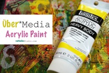
BTW – if you are interested in my Über*Media PanPastel Online Class- you can find it here.
Now that we have talked about the attitudes of our friends, their relationship on the color wheel and their tones and shades behind us- we can really turn our mind to more fun things – and try to answer the question:

But hey- this post today and yesterday was a lot to take in, wasn’t it? Tell you what, I give you a little break and come back next week, singing for you ![]()
Have an amazing day with lot’s of tints and shades ![]()
—————————————————————————————-
Colors Are Your Friends or let’s talk a bit of “my” Color Theory V
So today as promised we are looking for the answer to this question:

Actually Pablo Picasso said: “Why do two colors, put one next to the other, sing? Can one really explain this? no. Just as one can never learn how to paint.”
We might not really say, why- but we can figure out which paints do sing next to each other…that is fair enough, isn’t it?
Let’s see what kind of music our friends play together – but you will need yourcolor wheel!
Monochromatic:
Let’s start with what I call the “Lullaby of color combination”….

All the colors of a certain pure color: tints, shades and tones…with a little bit of cheating here and there ![]() I do not use it too often, although I have to say I love the calming effect a monochrome layout/art journal page gives.
I do not use it too often, although I have to say I love the calming effect a monochrome layout/art journal page gives.
Analogous:
Singing in simple melodies, basic harmonies and consistent rhythm – just like a Folk song – are analogous colors. They are three colors next to each other on the color wheel.

For this layout I had used blue, violet and red-violet.
Complementary:
Let’s check out Swing, that is complex with contrasting elements,has lots of vitality, the music instruments are cooking together. Fun. These are the colors that are sitting right across from each other on the color wheel

Here I used blue and orange mainly. But there is also for example red and green, yellow and violet and so on. The colors make each other appear brighter.
Triadic:
That is for me the pop bands under the color combinations ![]() Pop is appealing and pleasurable to listen to, it contains contrasting elements, but in doses. You find these colors equally spaced (triangle) from each other on the color wheel.
Pop is appealing and pleasurable to listen to, it contains contrasting elements, but in doses. You find these colors equally spaced (triangle) from each other on the color wheel.

Here I used orange, pink and green – but it could be for example also blue, yellow and red etc.
If you look at your work, what do you find you use most often as a color scheme: Monochromatic, Analogous, Complementary or Triadic?
Whatever it is that you answer, just based on what we talked about today, why don’t you try to break out today and create something with a color scheme you almost never use? For me that would be probably monochromatic ![]()
Next in this series I will show you some fun color combinations and where you can find inspirations for color combinations.
——————————————————————————————
Colors Are Your Friends or let’s talk a bit of “my” Color Theory VI
18MondayJun 2012
In case you missed the other posts of this series- I collected them all on this page here.
We are still discussing:
and with this last post in the series I wanted to show you which color combinations I love and where I find inspiration for those color combinations ![]()
So where do I find inspiration for color combos? I would say there are four main categories for me:
- Nature
- Street Art
- Art Work
- Catalogues or Magazines
I usually have my cell phone which has a camera with me anyway and as soon as I see something that I think will inspire me later for some color combination I take a photo for later. If I’m stuck or want to get out of my usual color routine I just scroll through my photos. Here are some that I have taken the last couple weeks just for that purpose with my phone.
1. Nature
Nature is an amazing source of color combinations- flowers especially- like this one:

See the colors that are in this flowers

2. Street Art
Often times graffiti or street art has some amazing color combos too – like this one

Love those colors together

3. Art Work
When I go to a museum or exhibition I also love looking for amazing color combinations- Like this painting by Neo Rauch – he rocks color combinations that are unusual in my opinion

I would have never thought by myself using those colors together

4. Catalogues or Magazines
I do not read a lot of fashion or gossip magazines but if I get one I usually just look for color combinations 🙂 and then …well…as you are looking you might as well just read the stories- right – LOL

these colors make me happy together

Here are some projects I created using some of my favorite color combinations at the moment ![]()

Here are the colors:

here is another one

and the colors:

And my beloved jewel tones

here is the color palette

And one last one ![]()

and the color palette

It is so much fun to be friends with Colors. After a while you do not even have to think much with which ones you want to hang around and which ones you want to bring together- I promise you – with just the little color theory we talked about in the past posts, you will instantly grab the right ones and make them sing in an amazing choir ![]()
I hope you enjoyed the “Colors Are Your Friends”- Series
Nat


Your colour theories and lessons are very helpful! I’m especially glad to know about the Panpastels as I plan to buy some of them.
I love colours so much that I use to save lovely pages from magazines.
Thank you Gerd- I am glad you like it. I collect magazine pages with wonderful color combinations too 🙂
I just finished reading this refreshing class äbout color combinations, and it took me about 40 year ago, when i started studying Interior Design. This class is a must for anyone who “plays” with color… So i have refreshed my old data which is basically reflected in your class, but in a particular way, compared to friends! Thanks a lot for this explanation with so many samples and details! Love it!
Your series is very much appreciated. My favourite part would be how your your colour inspirations. Thank you!
Brilliant explantion, so easy to understand, then seeing it working in your art work, gorgeous.
Your explanation helps me unmudddle my perceived confusion. It’s really not so complicated, right? I am going to find myself a colour wheel ….. Thank you so much!
I love your color theory….what a lovely way to explain it….friends. I am really friends with yellow right now which is kind of blowing me away, but hey, I’m going with it. This series is wonderful….thanks!!
Nathalie,
Thank you so much for sharing this! I think this is very helpful.
Thanks for this great series aabout colour. I love it but I procrastinate on what colours to use. I will add this series to my favourties!
Oh my word. You have captured color theory in such a clear, concise way! I enjoy your comparison to music, and your writing style in general. I HAD to pin your tint|shade|tone explanation – I swear I never remember which is which but I *think* your photo is going to stick in ye ol’ brain.
Such gorgeous article. Veruy useful, thank you!
AWESOME series!!!! 🙂
Cool and inspirational!!